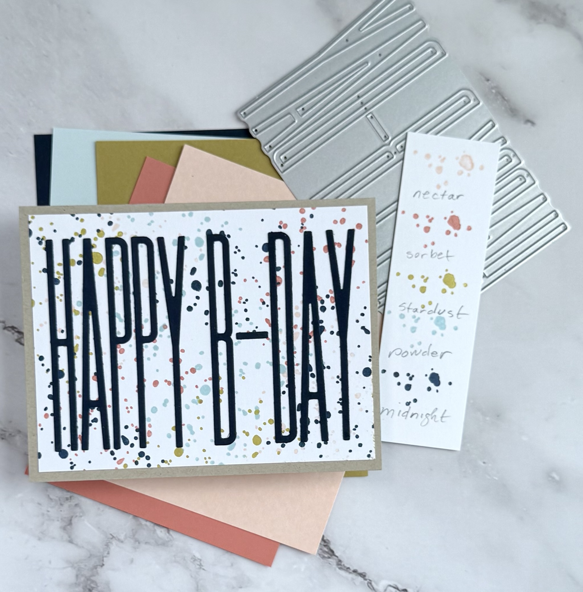
In the following birthday cards I use Essentials by Ellen Tall Happy B-Day by Julie die as the focal. It fits perfectly on a standard A2 card (4 1/4 x 5 1/2) while also leaving space to reveal your background design.

My confetti- like backgrounds are made by stamping Altenew’s Snowing small stamp over and over in no particular order using Concord & 9th’s (C9) ever growing palette of dye inks.

I focused on combos and palettes using four to five different colors. I chose one of these colors in the combo to die cut the birthday sentiment and then delicately glued it to the front of the stamped background.

This is a fun, super simple design that allows you to create a handful of cards with lovely color palettes that are mostly gender neutral.

Photographed with the cards are the die, C9 cardstock and also my homemade color swatches. The swatches I make using white cardstock scraps and a small blotchy stamp ( I think it’s from a C9 stamp set ). It’s low effort but works for me as a reference without using too much ink, paper or space.
I also write the ink names in pencil. I think the key to making practical color swatches is consistency in their overall appearance. I use the same stamp, pencil writing in lower case and same size paper scraps. No special purchases made for keeping track of favorite color combinations.

These cards have no extra layers or embellishments, letting the colorful backgrounds and sentiment do the work.
What are some ways that you showcase your favorite color combos of ink? Is there a color you find that works really well in multiple palettes? Nectar from C9 has become a favorite of mine.




Leave a Reply