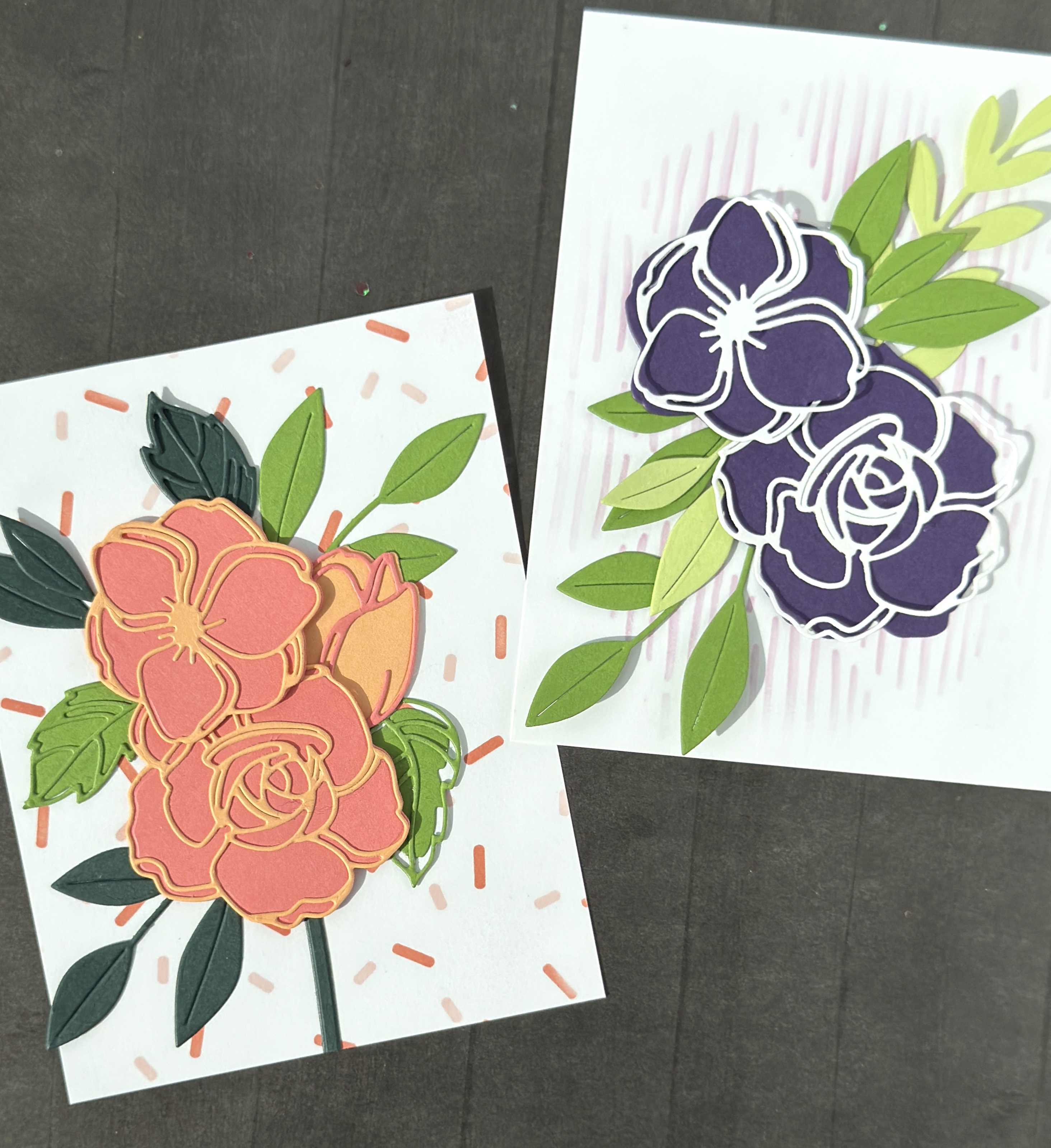
This is my third attempt at using a selection of Concord & 9th color combos selected by various crafters working in conjunction with C9. When I see these types of pins on Pinterest, it motivates me to use them as a challenge in my own card making. Here are the color swatches that I chose to design with:

Will they work for me? Do they push me out of a routine of producing a certain style card? Is the process of starting with a particular color palette too restrictive? How do I make the colors work for me? What kind of techniques will work best?
Card # 3 is based off the following color combo from Concord & 9th. I chose this one because it uses colors from all three releases of Concord & 9th’s dye ink line, most recently spring 2024 which includes Wildberry, Watermelon, Creamsicle, Grasshopper, Eucalyptus, and Rainforest. This palette also includes Lilac and Parsley.

When I purchased Concord & 9th’s dye inks in summer 2020, I bought them as my first full set of inks AND matching cardstock. For me it was a splurge: 22 “traditional and trendy” colors plus high quality cardstock to match each ink.
It was a big investment but also small in terms of how many other established ink brands were out there to choose from. It was a good sized collection for a beginner but also for a card making lover like me. I had been making cards consistently for over ten years and had a collection of small sets and singles from various ink brands. Having a complete collection of ink and the cardstock to match opened up new cohesion in designs and overall crafting abilities.
When the 2024 release came out I purchased five of the six new inks (all but Grasshopper, which I ended up buying later). They also had assorted cardstock packs available with two of each new color, allowing for sampling at a smaller cost. I quickly found my favorites, one being Rainforest, featured in this color combo.

This is Floral Doodles Die Set from Altenew. I absolutely love it! Having already made two cards with it, I knew that it would be a good fit for one of the colors palette challenges. With colored cardstock and a beautiful botanical die set, I got to work.

This card features Watermelon background florals with Creamsicle outlines and one tulip die (tucked under) in reverse. I used Parsley for some of the leaves from Floral Doodles and Rainforest for others. I also used leaves from Papertrey Ink’s die set, Into the Blooms: Christmas Sprigs (which, without it, I wouldn’t have half the cards that I’ve made this year 😉 ).
The background is from Ellen Hutson’s Sprinkles by Heather stencil set. The inks used are C9’s Ballet Slipper and Sorbet. The Sorbet looks a lot like Watermelon in the photo but they are very different and it’s probably my lighting that makes them look identical. Sorbet has a darker, richer tone than Watermelon which is a bit poppier in color.

I didn’t use all of the colors in this combo on one card so I went ahead and made another. For the background Lilac ink was applied using the Sketched Lines Stencil from Altenew. My greenery is die cut from Parsley and Sprout cardstock using the Christmas Sprigs die set. My flower backgrounds are cut from C9’s Eggplant cardstock.
This card ends up looking more like Cathy Zielske’s color palette but without the Aqua Sky, and Eggplant instead of Fig. I like the bold, rich Eggplant in contrast with the white cardstock outlines. I love how both cards turned out and I have more backgrounds and die cuts to use for more cards in the future.

I didn’t exactly get all the colors onto one card and that’s something to think about when I move on to my next challenge. I’d really like to add more C9 cardstock colors to my collection and will see what I’m using most in design and application before I purchased.
These are also not finished cards. They haven’t been affixed to a card base and I haven’t added sentiments which I may not. Mostly I want to move on making more card fronts with various color combos using paper I already have and backgrounds that I already started.
Hope you’ve set up your own Color Combo Card Challenge! There are so many places to draw on for color inspiration. What card challenges out there do you participate? How do you draw inspiration?
See more cards using Altenew’s Floral Doodles Die Set here .

Leave a Reply