As we move along let’s set up a framework for talking about the elements of a card design.
I’ve decided on eight different elements to outline and, as you will read, they often overlap. This framework will not only serve as a guide for you when designing and making your own cards, but as a frame for me when I’m showcasing cards or breaking down elements of a particular design.
If you want to go beyond looking at photos of cards and lists of products, then you’ll find my posts will offer more information on what I’ve constructed and how I got to it. Note: not all elements will be explained all the time.
Here’s the list:
- Theme
- Focus
- Color Palette
- Frames
- Background
- Layers & Dimension
- Embellishments
- Sentiments
I’ve established a list of elements, now let’s create a description for each with more detail of what the element does or may include. This begins the frame.
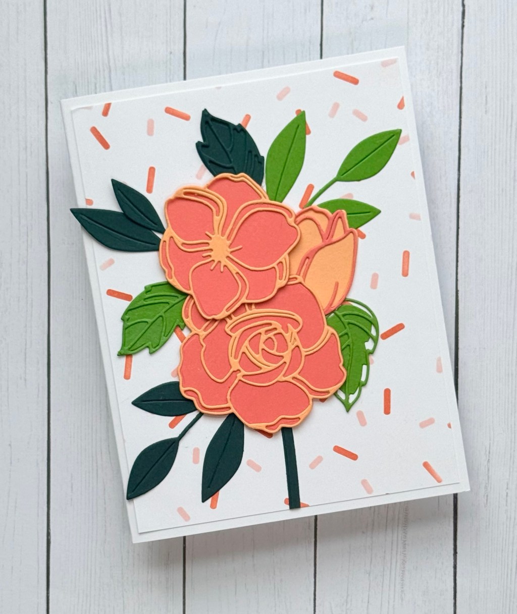
Theme
Theme may be intentional like ‘birthday’ or other holiday or ‘general botanical’ because you just got a new orange blossom die set and can’t wait to try it. Sometimes themes emerge secondary when we start with a color palette. Theme can overlap with focus, like using the cake die as a focus directly supports the theme. They support each other and provide two of the strongest elements in a design.
Focus
Focus is just that. What is the main focus of the card? What is the eye meant to be drawn to first? How does this deepen the theme? How does the focus make use of the color palette? Is it effective? Focus, Theme and Color Palette all overlap and are dominant attributes in the first stages of making decisions about a card’s design. No matter what, a card design will have some focus (either large, medium or small), otherwise you just have a background and a frame.
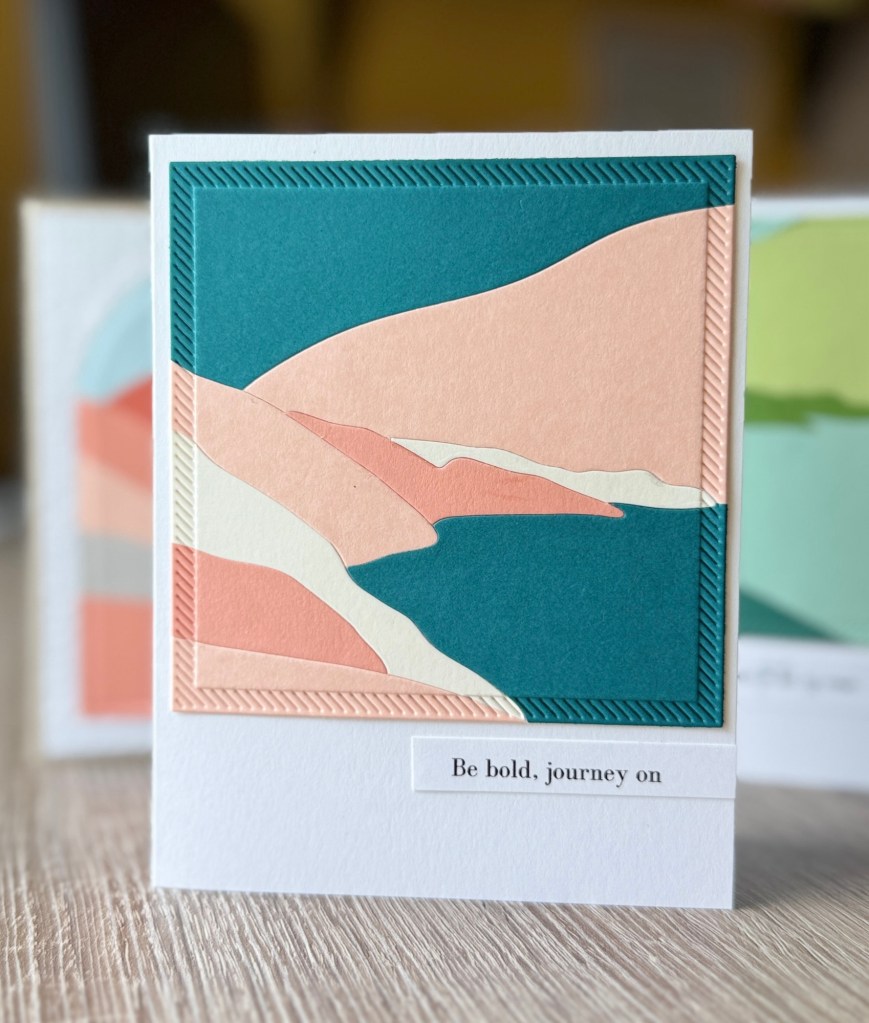
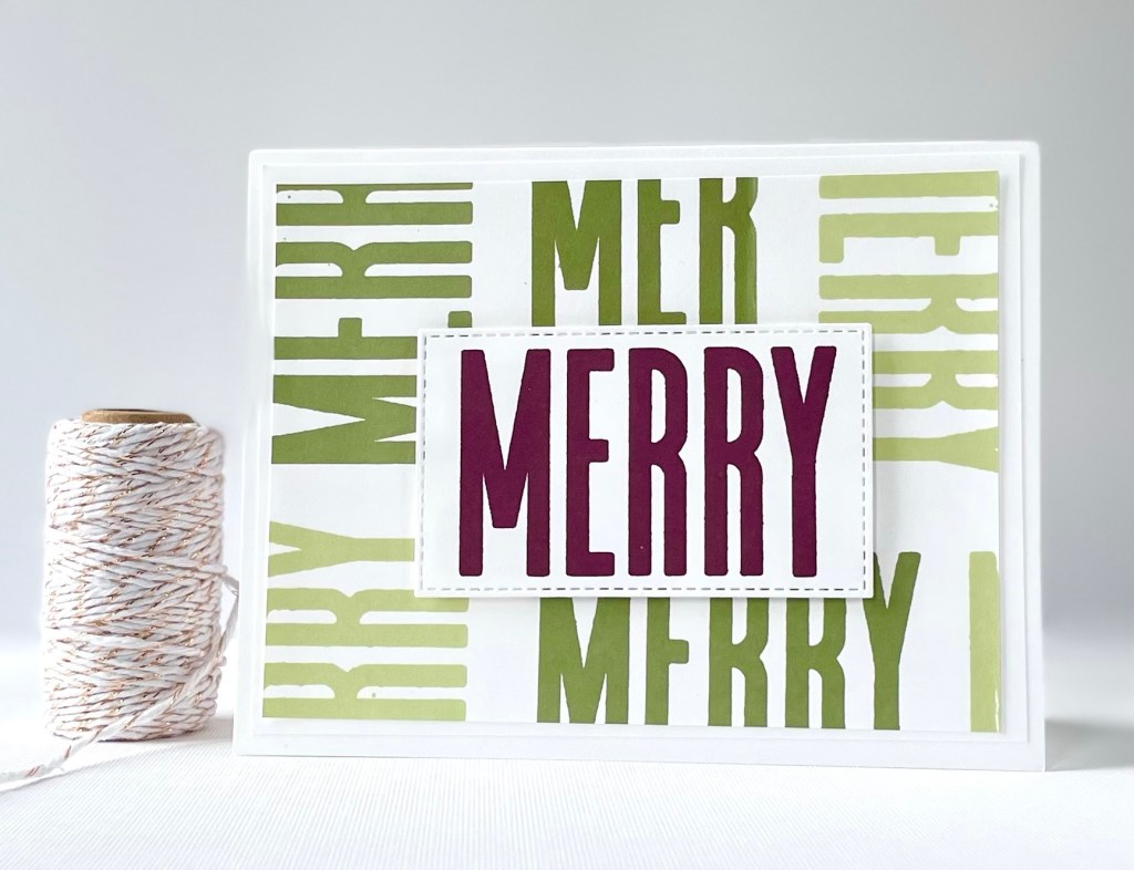
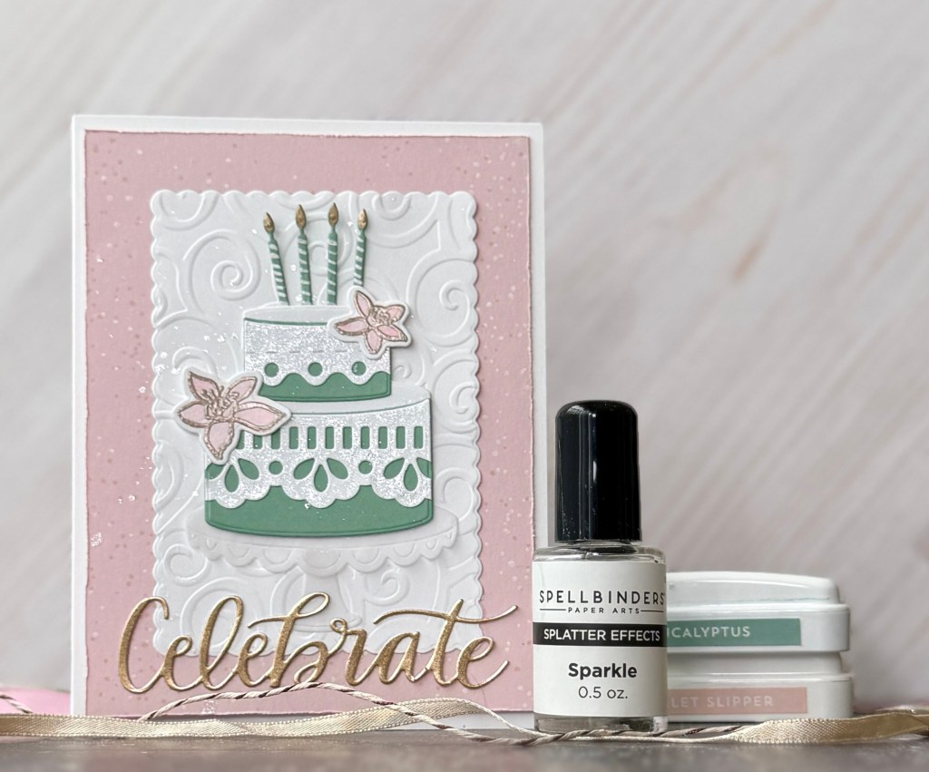
Color Palette
Color Palette is one of my favorite elements. It’s simply a selection of colors that you use together. It could be several colors or only a few. It can be one color with various tones. As the designer you decide which colors, tones, inks and cardstocks to use. You decide which colors to use where and in what quantities? Do the colors compliment? How are they used together in what elements? Is it effective? Do the colors work together or seem to clash and compete? Does the color palette pull together the theme, focus and background?
Are you sometimes intimidated by color? Don’t worry! We don’t have to re-invent the color wheel! There really is a bit of science and theory behind it. If you’re interested in more info on color palettes or working with ink see my Ink Reference Page here.
Frames
Frames include overall card size (ie, A2, A7, 5×5) and the frame style used for the base layer and any other layers that may be used for dimension in the card design. You can build up various frames to create unique layers that act as a focus. These layers can showcase a background, balance with a background, and build up the use of the color palette. The frame can also be quite simple. Keep in mind: more layers and frames mean more dimension.
Background
Backgrounds are obviously not meant to be a focus but they can have just as much character, beauty and purposefulness to the overall design as you might find in a themed focus, glittery embellishment or unique frame. Backgrounds can be stamped, inked, embossed, framed, embellished, die cut and pasted or simply left plain. They really are a crucial element to any card.
The absence of background images or color serves its own purpose in design as white space levels are established, or deciding how much card stock you want to use. Having a small focus and sparse empty space may be your crafting style or one you experiment with.
Note: Style is not an element listed here. This is because all the elements eventually work together to express the style of the card or creator. If you make the same decisions about each element over and over again with little variation, this becomes your style. There is also a general card style representative of many techniques and configurations that are used often by crafters. I would say that having a lot of white space in a card design is a type of card style even though individual crafters might make use of their focus or embellishments in many different ways.
Layers & Dimension
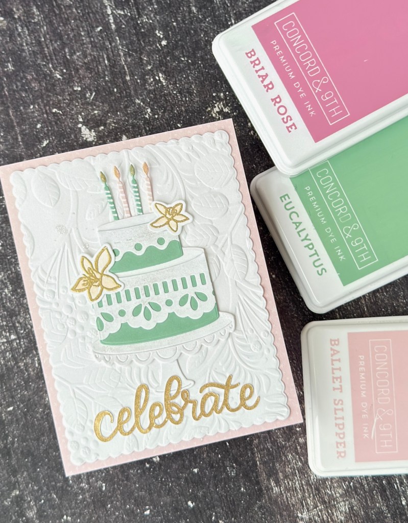
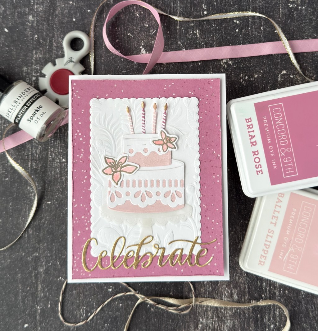
Layers & Dimension overall refers to basically width and depth. Variations include shapes and quantities. You can add dimension with a layer like using three different frames stacked together artfully or building up one layer with dimensional foam, tape or gluing techniques such as stacking multiple layers of a die together to build its depth. Dimensions also include added elements like Nova Drops, sequins, ribbon, fabric, more paper or texture paper. These also act as embellishments, like the small heat embossed, die cut flowers that decorate my cakes. It’s an added embellishment but also adds dimension. All embellishments add dimension but not all layers are embellishments. Hmm.
Embellishments
Embellishments include anything added in addition to the basic focus, background, or color palette. Embellishments are meant to add some beauty or pizzazz to the overall design of the card without competing with it. If you have a theme, you want your embellishments to support it, not deter or distract, possibly challenge though if it’s your style.
You might like to use a certain embellishment across many of your card designs like Spellbinder’s Sparkle medium or Tim Holtz’ Rock Candy, because you like that extra glittery touch. You might also change up your embellishments based on the overall card theme or style. Background splatter isn’t always appropriate on every card design but you may choose to work with designs that allow for it more so that you can work with the technique and experiment.
Note: Technique is also not part of the list because it comes along in the process as you make decisions about the elements and how you’re going to build with them. You may even want to focus on practicing or learning a specific technique, like Distress Ink water color smooshing with an acrylic block onto water color paper, but that’s only going to be part of what will become a finished design. You still have to decide to frame everything, find purpose with it and then layer and embellish, otherwise you don’t move past the Experimental stage of the crafting basics.
To learn more about The Stages of Crafting travel here.
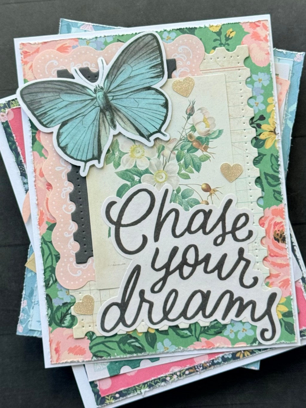
Sentiments
Sentiments may be last in the list but they can also be the focus. In this card here, I made most decisions based on the size of the sentiment that I was using. I had to customize a card base and size to fit this very bold ‘Thinking of You’. The design is not my original btw, taken straight from another card maker. I merely wanted to recreate a design that I saw in the crafting world using things that I already had. I landed on this.
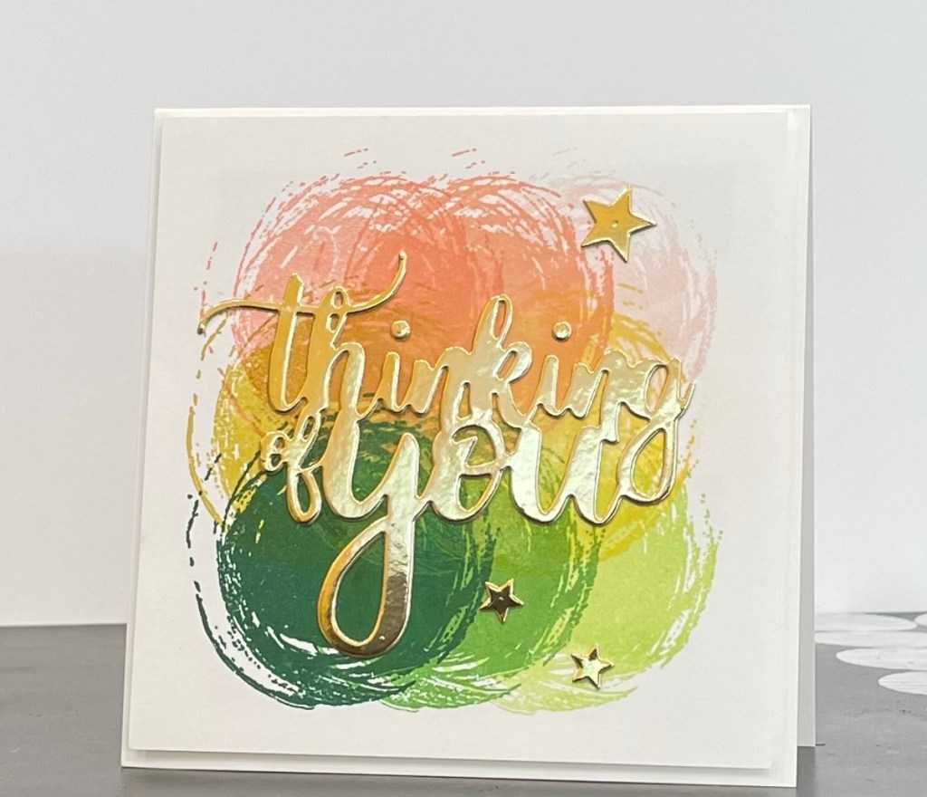
The design also did not disappoint when it came to playing with color palettes.
Not every card even needs a prominent sentiment. A sentiment or theme can be forced into the background for a subtle effect. Adding a sentiment on the card front is optional. A sentiment can feel like it supports the theme, act as a focus, can also pose a challenge for when you do have a need for a particular sentiment that you want as a die cut or stamped word or phrase. You are limited to the market place selection and paying for it or trying to design your own using software and an electronic, software compatible die cutting machine like the Cricut Explore Air or Silhouette Cameo machines.
Often sentiments are used to balance the design of the card. They become layers, embellishments, even cut out frames. The words become more element than expression. But they should match up to the theme or add something of interest and value.
This framework is meant to deconstruct the basic elements of card making for you as a designer and maker, and for me as I walk through highlighting various cards that I’ve made or have been inspired by. There is no higher level learning, science of design, or new information here, just a terminology framework with which we can communicate.
A framework is always helpful but never necessary on the path to finding your design!

Leave a comment