Sometimes I get drawn in by pretty paper.
This is why so many card crafters end up addressing their surplus of patterned paper and how to use it!
This is also why I like small 6×6 or 6×8 pads. They give me enough product without being a space hog. And truthfully, some of these paper patterns are too adorable to resist! So colorful, and so unique, the images rekindle the spirit and spark imagination.
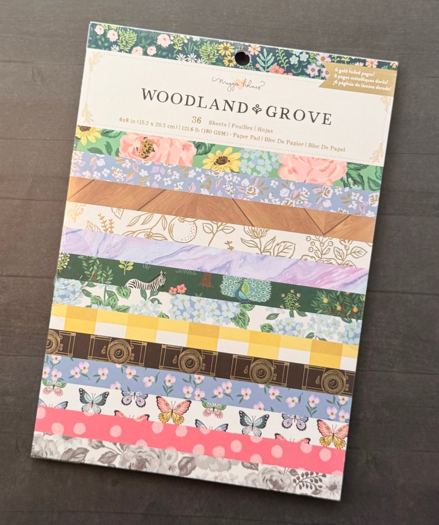
This is how it began with Maggie Holmes’ Woodland Grove collection. This is one of many scrapbooking collections produced by American Crafts. It’s also the first time that I’ve purchased patterned cardstock with matching ephemera and stickers belonging to a set. I don’t scrapbook, but I could see the collection’s potential for crafting cards, trying out a new style and creating lovely gifts.
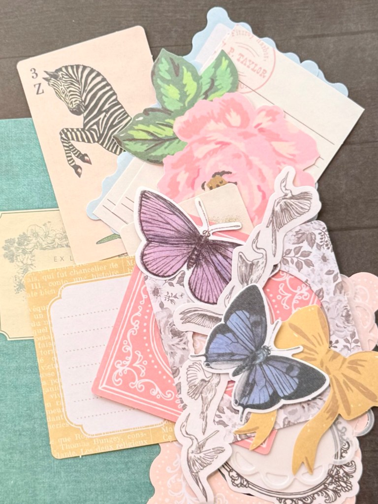
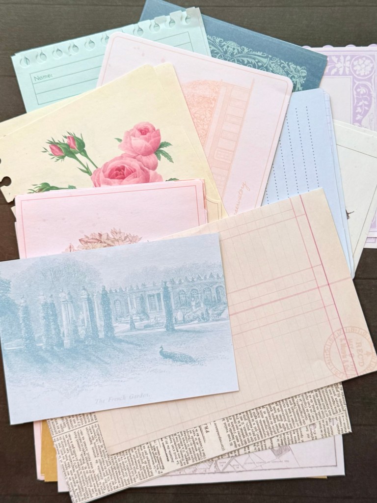
Here are some of the elements in this type of collection. You can buy products from the set a la carte or as a kit. The patterned paper comes in a couple different sized packs. There are light weight paper ephemera sheets in large and medium sizes (up to 200 pieces per pack), washi tapes and washi tape stickers, all coordinating together.
The benefits of using this type of collection are that the themes and color palettes work together instantly. That’s how they’re designed. So from a design perspective those two elements are already working for you, just choose the collection that speaks the most to you. They are also easy to add to and compliment with other elements not from the collection. Use your own steel die frames, flowers or sentiments for variation.
Currently American Crafts is having a HUGE up to 80% off vault sale with free shipping on orders $75 or more.
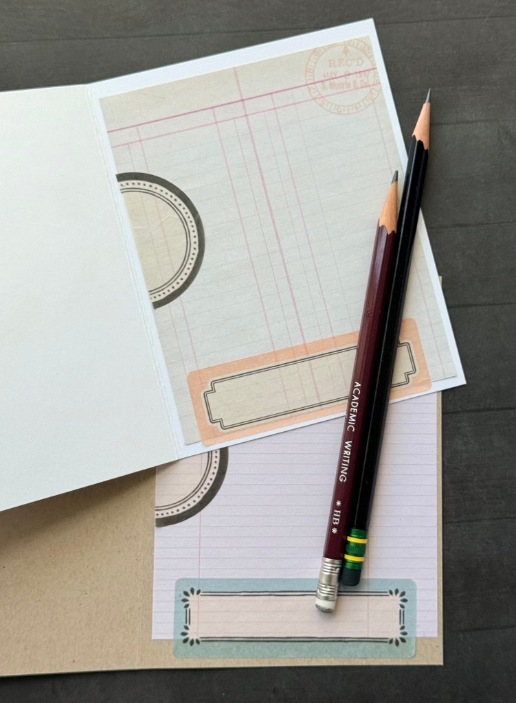
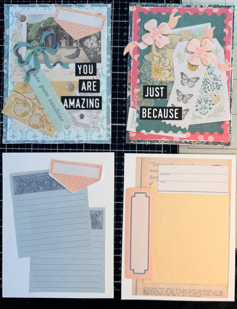
I started with an experimenting session. For some reason I felt like I needed to use decoupage glue on everything. Turns out, so not necessary! These are the cards that I made on my first run through. Complete with decoupaged finish. With the idea from another card creator on YouTube, I used the ephemera to create a writing space inside the cards. How fantastic! Continue the theme and use up the paper.
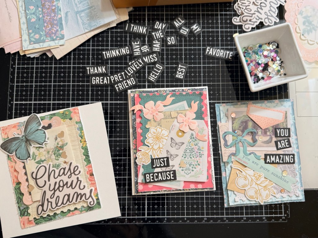
These first attempts felt busy and uncoordinated for me. I liked the cards but I thought that I could improve upon them, there was so much to love. As I worked I discovered that I felt more satisfied when I used controlled layering of backgrounds and ephemera: using less pieces of embellishment and layering consistently with more right angles.
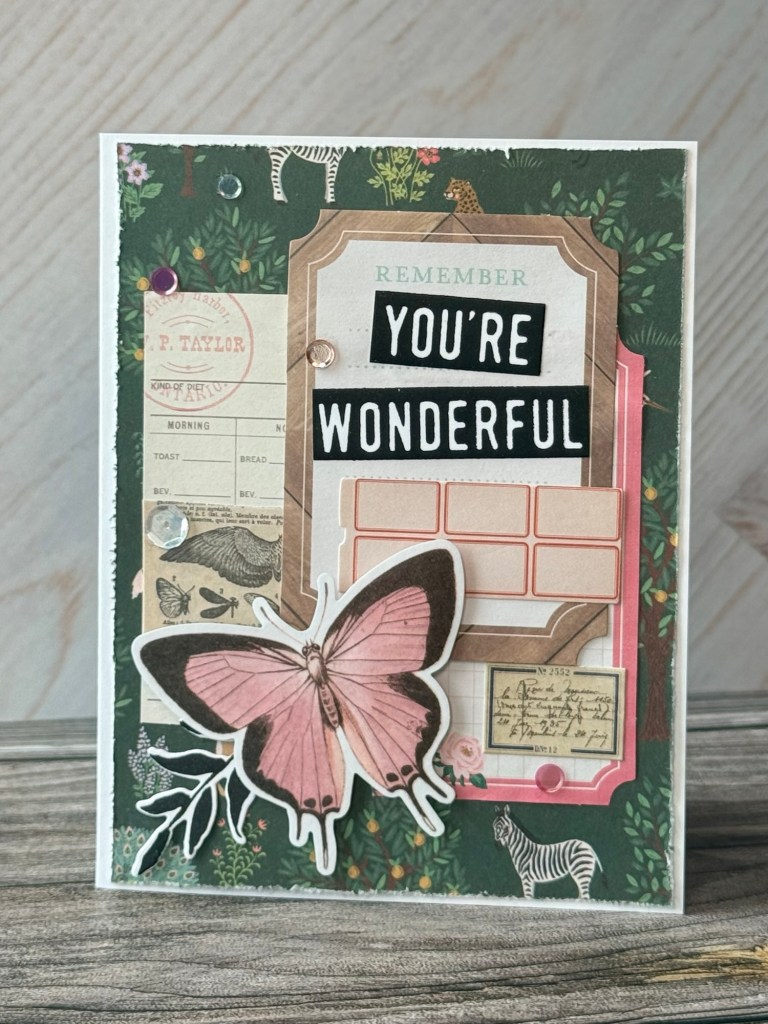
Here’s a remake of one of the first card attempts. The color palate sticks to blue, pink and neutral with a tiny bit of yellow/gold (all from the collection). The same sentiments are now blocked to the right of the card. Notice the two base layers and one middle die cut layer are all at right angles. Even two mid-layer ephemera at top of card are right angled though off set. Four elements are still at an angle but they all lead to the blue prize bow and the peacock sunning itself in the garden.
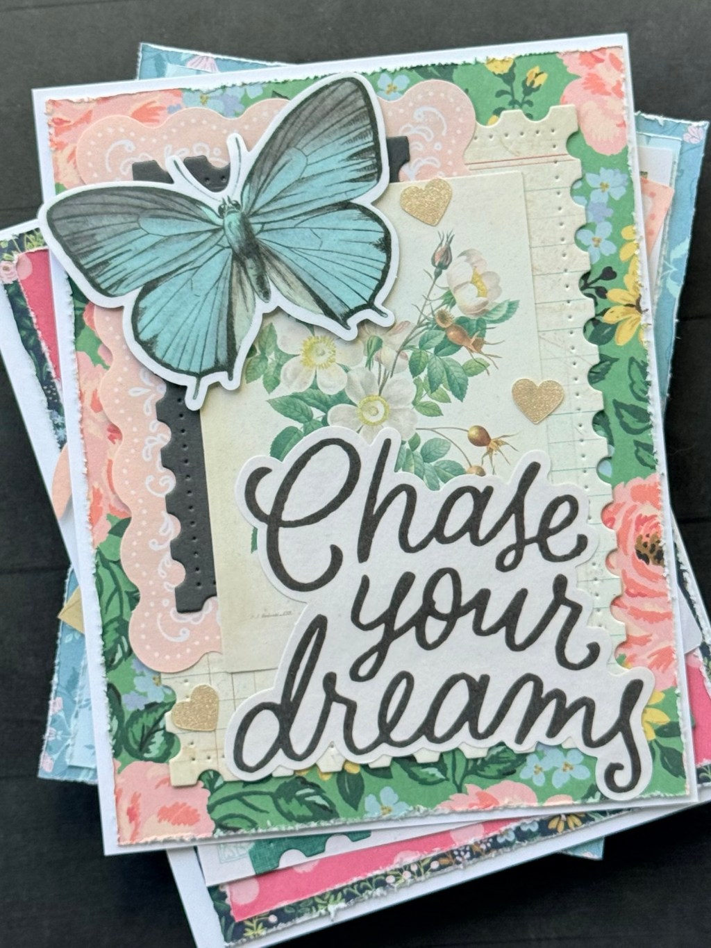
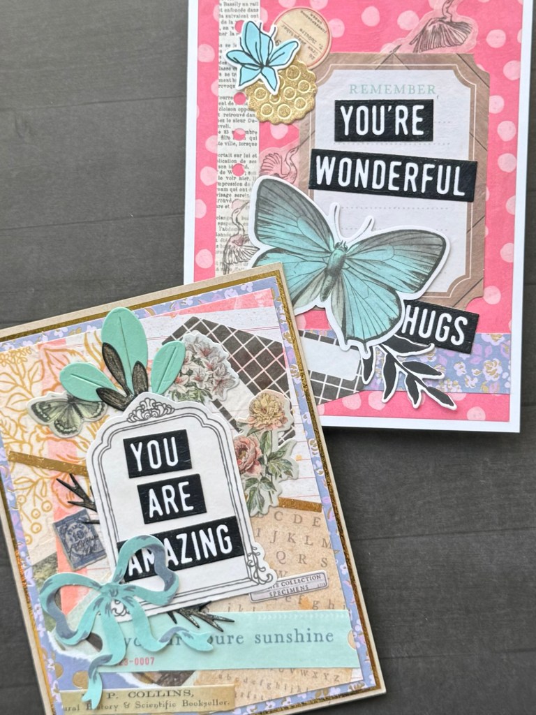
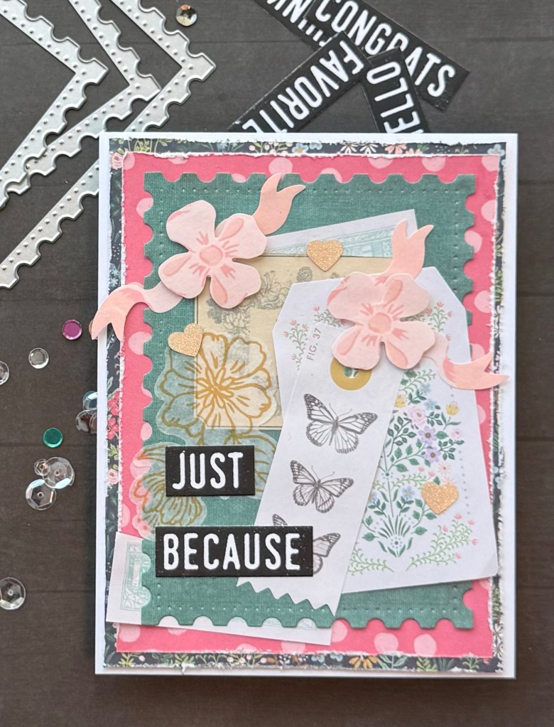
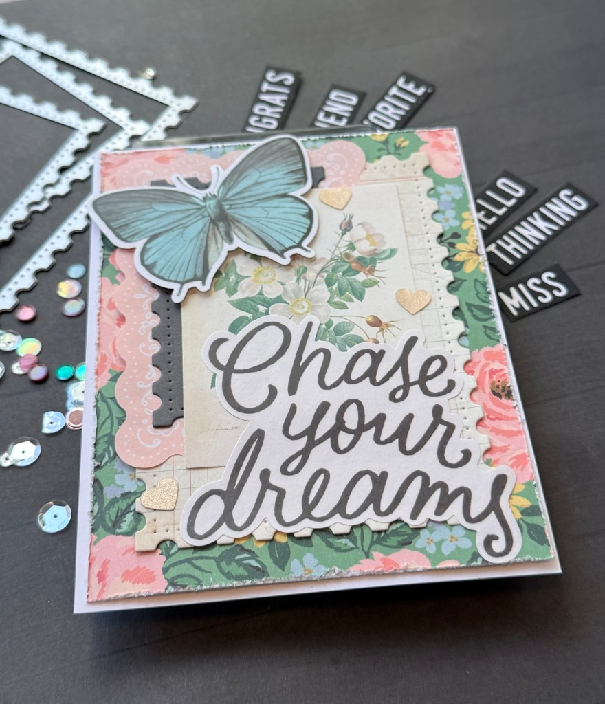
The large sentiments work on these cards, anchoring stacks of right angled layers. I use Nested Rectangles Postage Edge from Pinkfresh Studio on two of the layers. The color palette lends towards pink, green, light yellow and blue. The blue butterfly brings out the subtle blue in the base layer pattern paper.
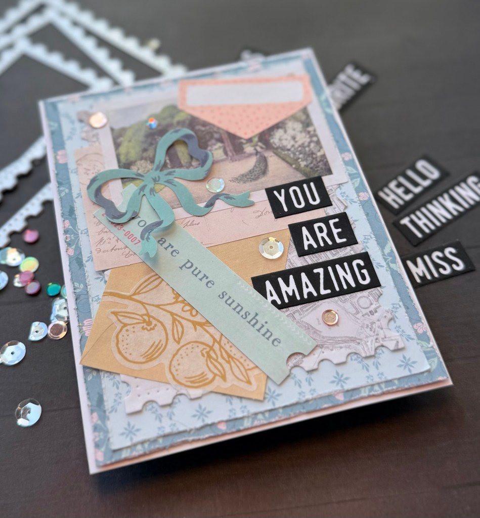
This card is meant as a positive affirmation for the recipient. ‘YOU ARE AMAZING’ in bold white on black backgrounds, a set from Concord & 9th called Mix & Match Everyday Sentiments Stamp and Die Set, stand out yet still blend with the style of the card. The same sentiment is further reinforced by the blue ephemera that looks like a ticket and reads ‘you are pure sunshine.’
I love the kit’s washi tape stickers. Here I have used them two ways: with the sticker backing peeled (flower in gold, mid-left) and with backing still on leaving the image opaque (pink flowers). I also began to cut slightly larger background base layers so that I could distress the edges. I usually cut my base layer to 4 x 5 1/4 for an A2 card. For these I started with 4 1/8 x 5 5/8. You can use a distress tool, like the one from Tim Holtz, or you can simply use the open edge of a pair of scissors.
For me this style of card is less about a focus and more about telling a story. This is why the ephemera and stickers are so fun to work with. I chose this set because there’s a lot of details around natural history, library science and botanicals. The colors are soft but rich, while the cardstock offers vibrant images.
Another positive to using this collection is that the pack has two of everything! If you like some element but maybe didn’t like what you did on your first attempt, then there’s a second one of the same thing, or something similar and interchangeable to use and do over. Or you get to make two identical layouts!
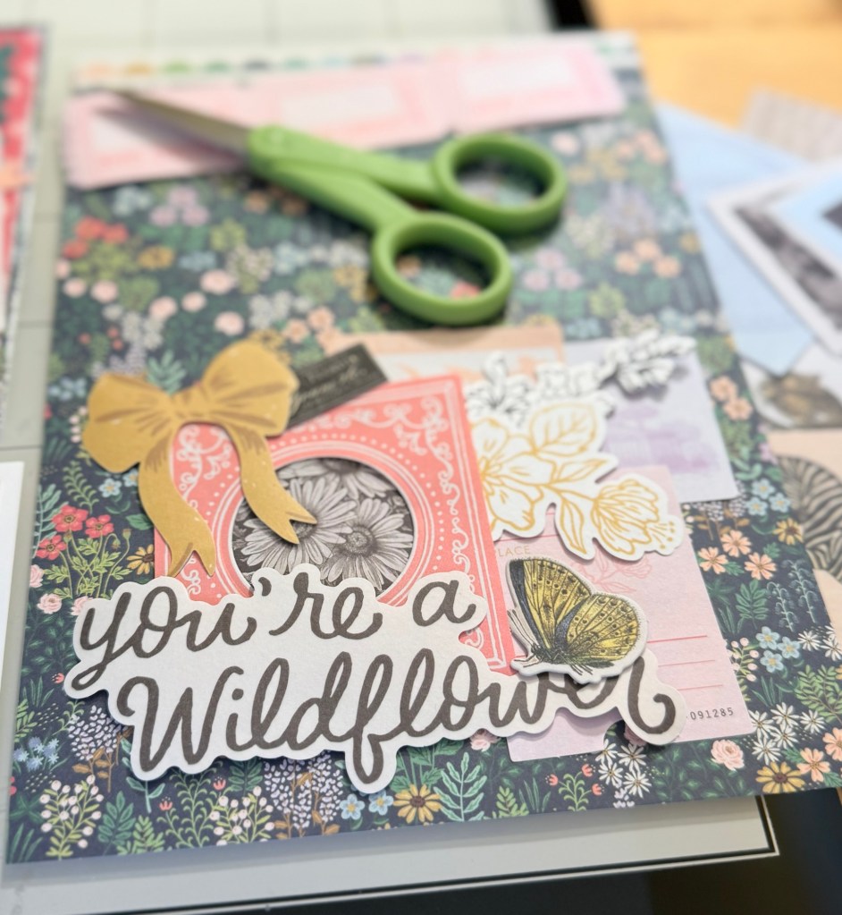
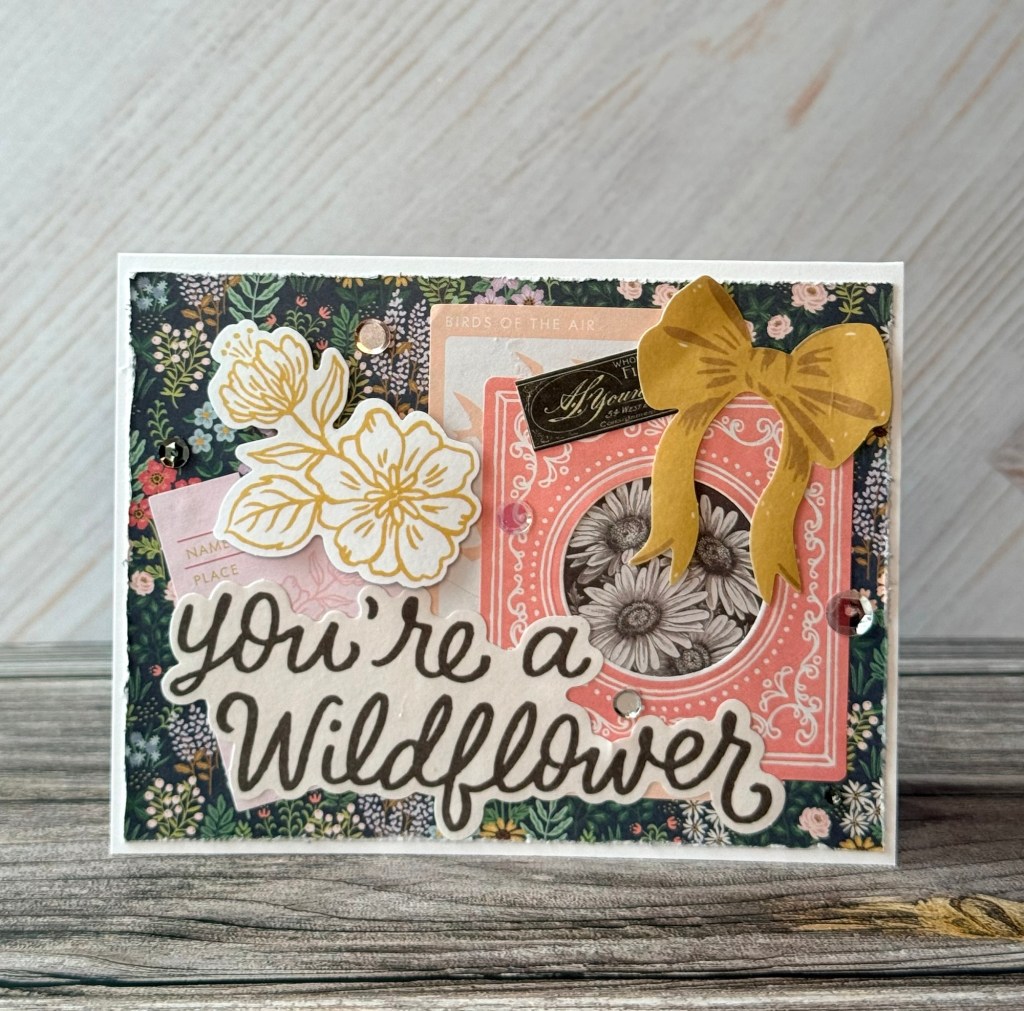
Another bold washi tape sentiment from the kit is ‘You’re a Wildflower.’ I decided to leave the backing on the washi stickers to keep their appearance opaque in this card. This includes the sentiment, the golden bow and the gold outlined botanical. Another gold/ yellow addition, to continue with the palette, is the little butterfly from Tim Holtz’s Field Note Snippets Ephemera Pack on one of these designs. By leaving the washi tape on their backing, it allows the card recipient to remove them and use them wherever they wish! Now the cards have become interactive.
These are just one style of card using a scrapbooking set. I had fun composing stories with the ephemera. The cards are quite different from others that I have made and I fully enjoyed the challenge. Essentially all the elements of designing are the same from choosing a background to working within a color palette to adding the final embellishments. For more about card design see this post here.
Do you make cards using your scrapbooking sets? Have you made cards using ephemera from these kits or from Tim Holtz’s idea-ology collections? Are you a collage card maker? I hope to work with this style more and so expect to see another experimental session in the future.


Leave a comment