
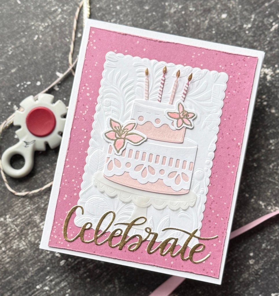
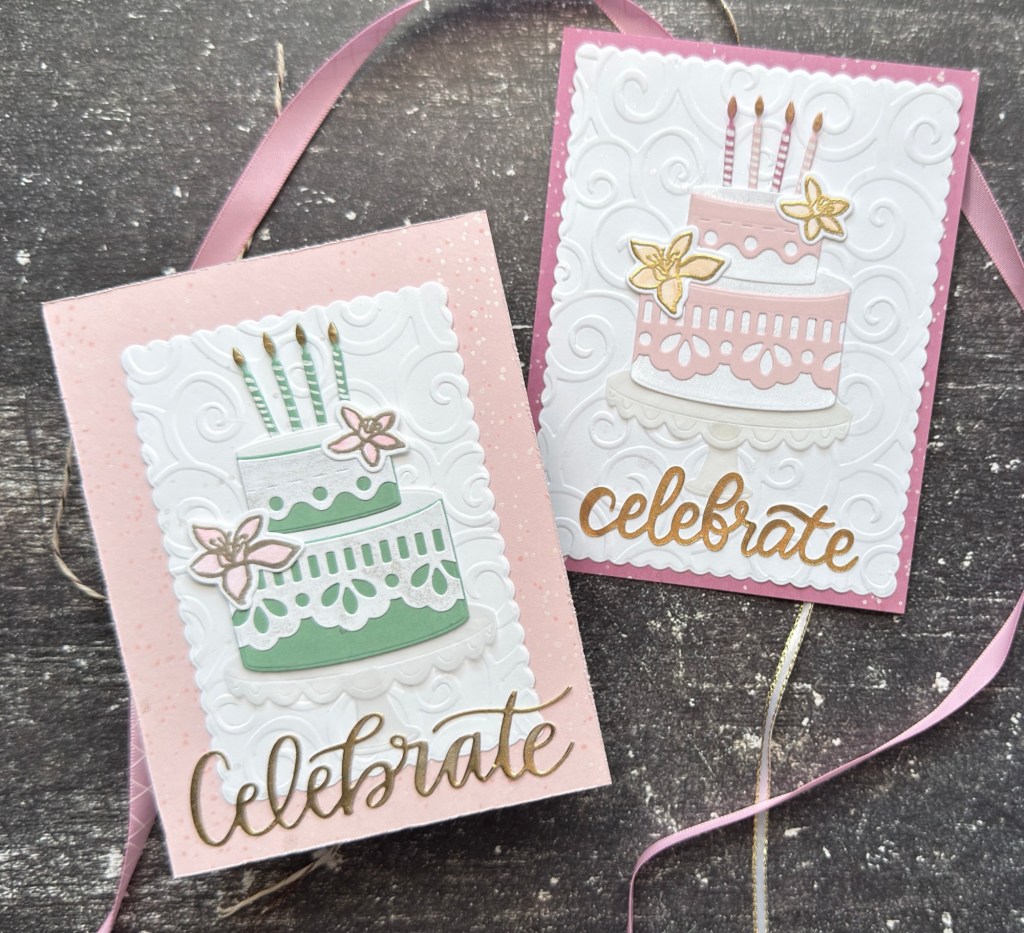
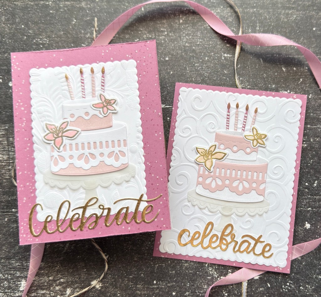
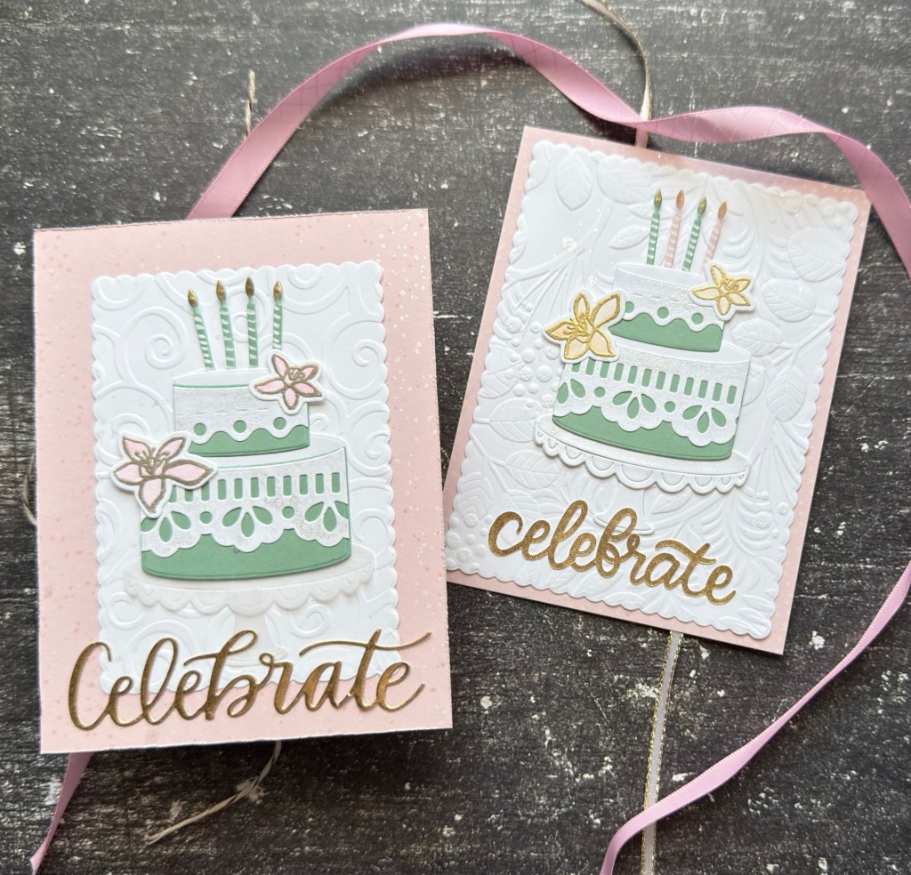
Using the same Cake and Sparkles theme seen here, I decided to rework the designs with the elements I liked best and then plan and create a cohesive set of cards using a limited color palette, different framing elements and backgrounds, and one large sentiment.
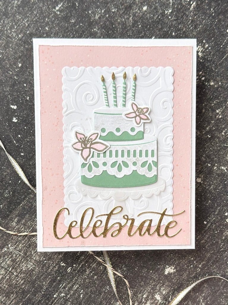
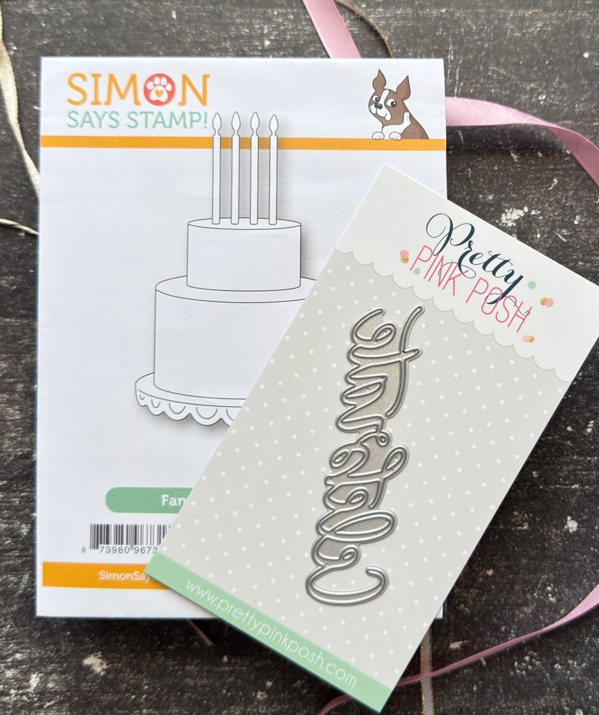
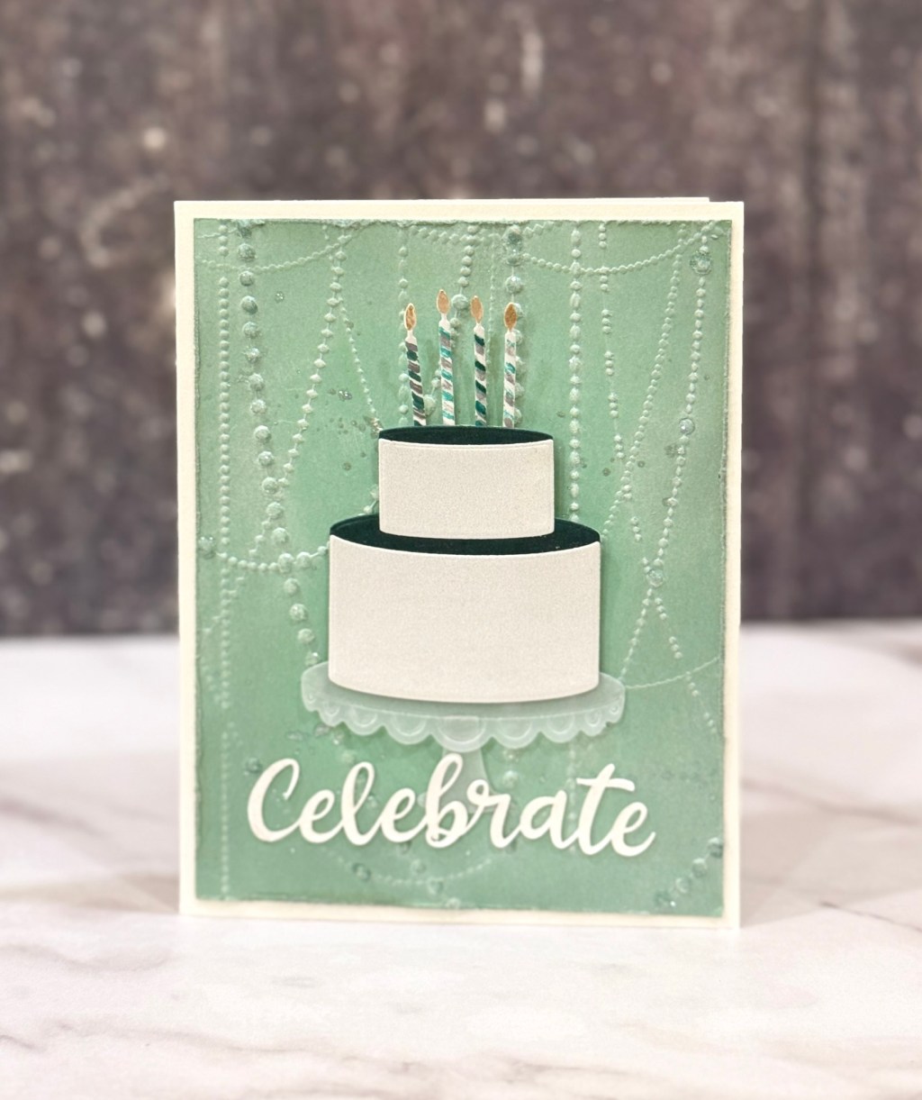
I’m using Simon Says Stamp Fancy Cake Set as the focal image. The cake concept includes embellishments like fancy edging for the icing layers in white, decorated with colorful candles and embossed, water colored flowers. Decorating the cake was just as important as decorating the whole card.
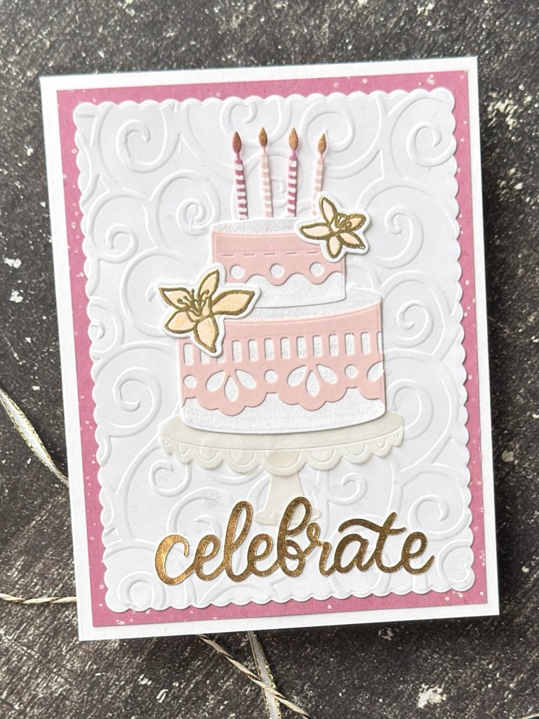
Each card has an embossed white area as a layer and frame. The embossing folders I used include SSS Vine Canopy on two cards and Cricut Cuttlebug D’Vine Swirl on the other two. In addition I created card base backgrounds on Concord & 9th’s colored cardstock in Ballet Slipper and Briar Rose.
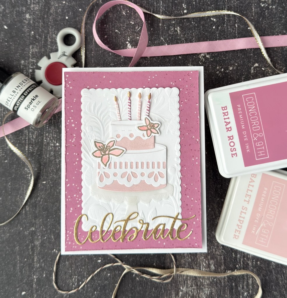
These two colors are part of a five color palette chosen for this set: Ballet Slipper, Briar Rose, Eucalyptus, Gold and White. Two shades of pink, add a complementary green, then a metallic like gold (acts as an embellishment also) while also experimenting with the level of white space. Do I prefer more white in the mid- layer or more exposed color? Which do you prefer?
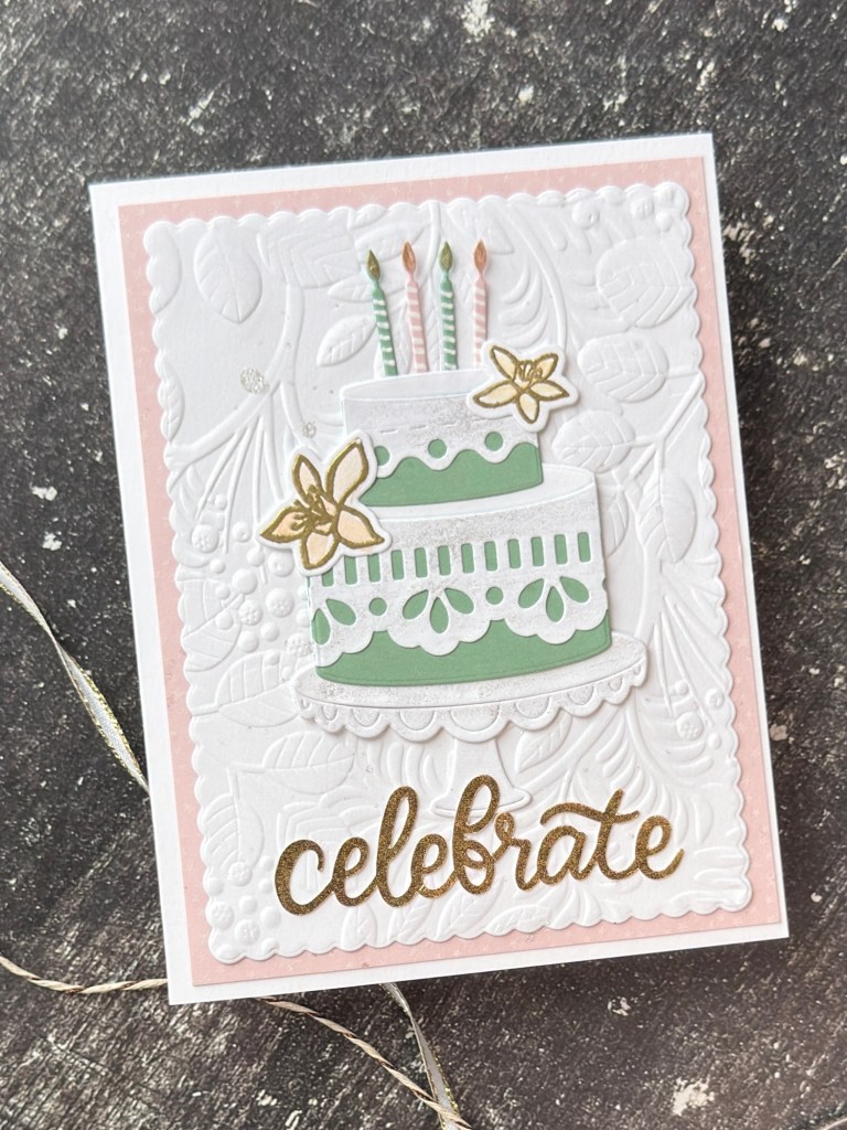
The cards are framed using either a straight cut background or one that has been distressed using the Tim Holtz Distressor. The mid-layer is also cut with SSS A2 Scalloped Rectangles. I like how the scallop shape is repeated with the frame, cake icing layer and cake stand.
The backgrounds were created by stamping with Ellen Hutson’s ‘lived in’ background stamp from Mediterranean Breeze Stamp Set Combo. The backgrounds are stamped once in Brilliance Moonlight White and then again, with cardstock rotated, in the corresponding ink of the cardstock to add a subtle tone-on-tone effect. This technique can be seen more in the two cards with the smaller embossed white layer, which also happens to be my favorite design of the two.
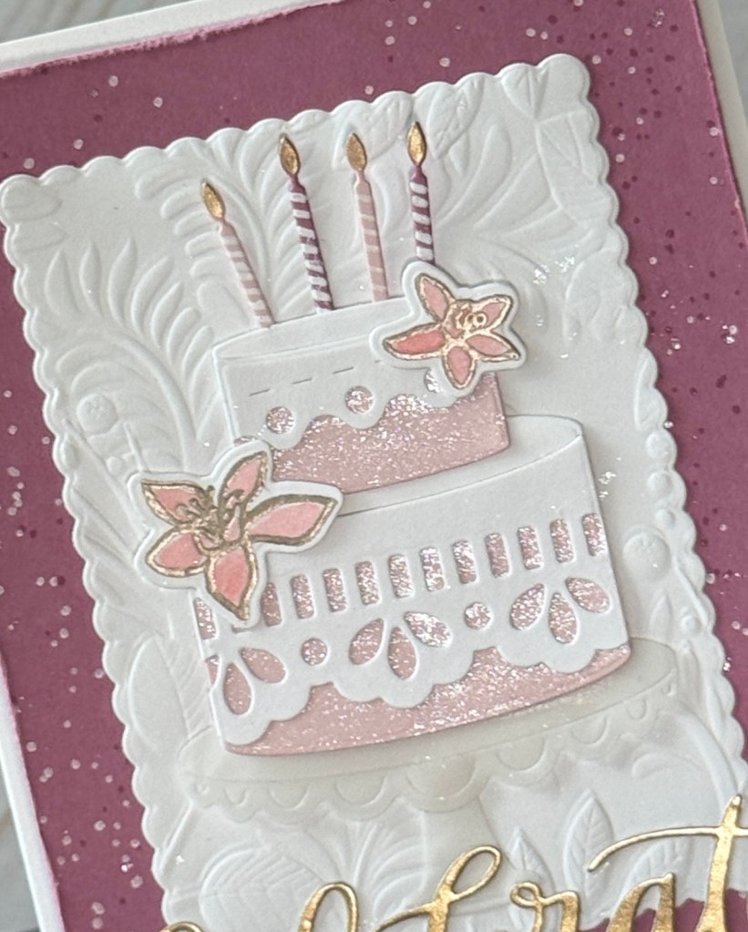
The embellishments are seen more easily in a close up photo: Tte metallic embossing on the flower; the stripes and flames on the candles added with Gelly Role pens; and Spellbinder’s Sparkle lightly painted across either the icing layer or base layer of the cakes. I also lightly splattered Sparkle across the embossed layers and backgrounds before adding the decorated cake focus and sentiment to the card front.

Choosing the ‘celebrate’ dies had its own process. I knew that I wanted the word ‘celebrate’ and not birthday or congrats. I knew I wanted it die-cut in metallic gold cardstock, adding to the color palette of the card. The challenge was that I didn’t have a ‘celebrate’ die. This added a little more time (and shopping, searching and experimenting) to my overall project but I came out of it with two workable solutions for future use in designs. With different placement, framing and layering this card could easily exist without a sentiment.
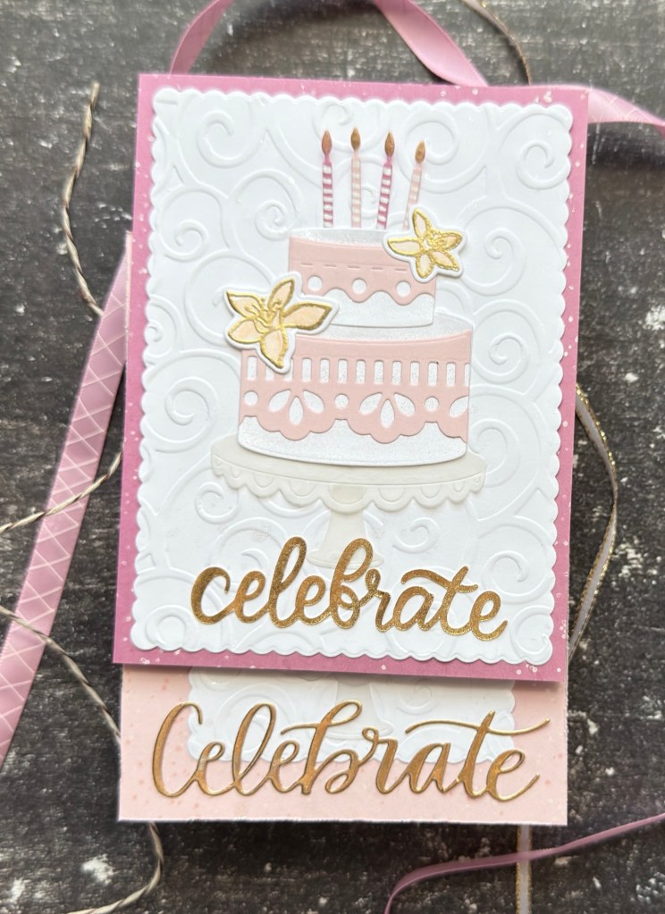
I hope to use this design again. I could mix up the color palettes, change the embellishments on the cake focus, or change the framing and backgrounds. There are so many options! Which will you try?


Leave a comment