
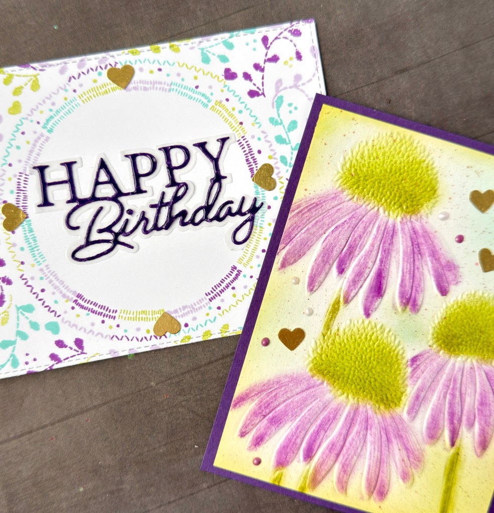
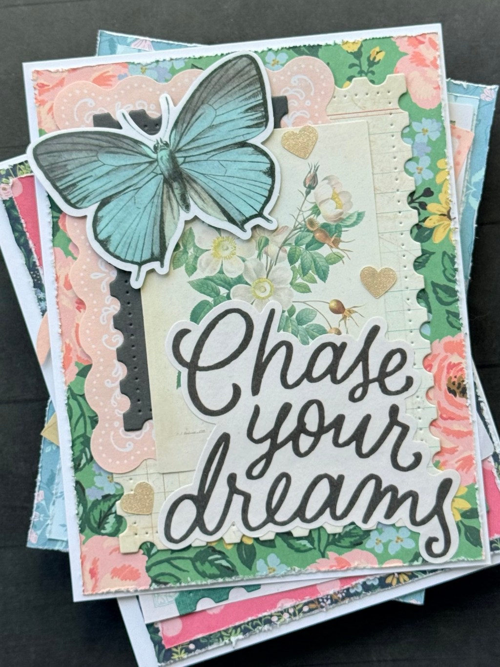
Being fascinated with color combinations and all of the possibilities with ink and paper, I decided to use the Concord & 9th color combos found on Pinterest as a personal challenge to my card making. See the original post here.
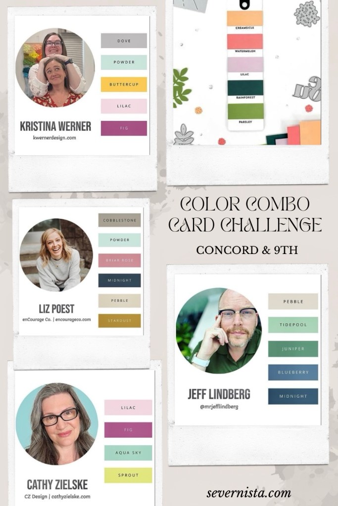
I first started with Jeff Lindberg’s color pallet and produced two cards for general occasions. You can find those cards in more detail here.
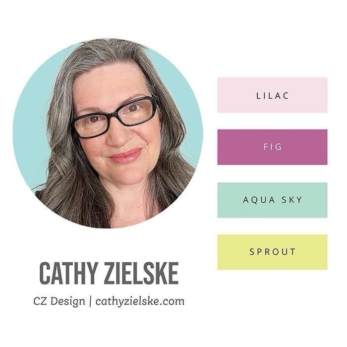
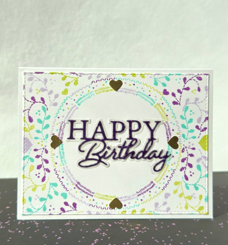
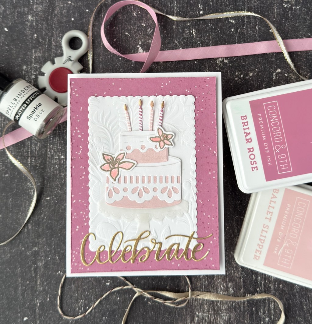
Next on my list is Cathy Zielske’s four color combo which includes Concord & 9th’s Lilac, Fig, Aqua Sky and Sprout. Lilac and Fig are from C9’s 2023 dye ink release. I’m guessing that these color combos have been around a bit but still worth the challenge.
My first thought with this color combo is that it’s four colors and a perfect number of inks for a C9 Turnabout™ stamp. If you’re not familiar with them check them out here. Turnabout stamps are an image designed to be stamped and ‘turned’ four times to create a lovely background. They have various themes and no shortage of tutorials if this type of stamp seems intimidating. I will say that a stamping platform of any brand is a must to get these lined up properly so that your final image is spot on.
I chose the Stitched Turnabout™ Stamp Set and I’m very happy with the result.
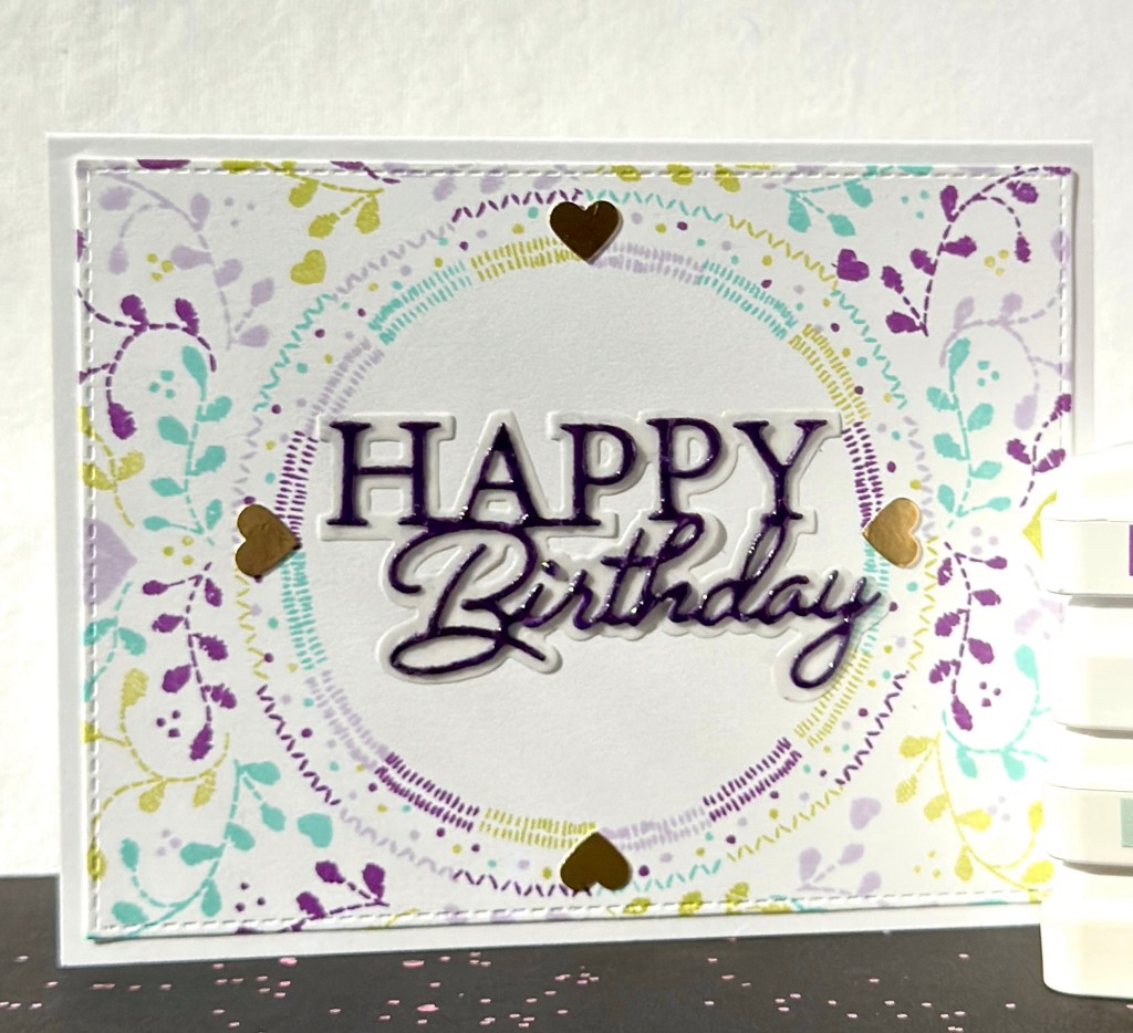
For my sentiment I used a ‘Happy Birthday’ die from Memory Box. The paper is a dark plum color (I do not have Fig paper) and the shadow to the die has been cut from vellum. Before I adhered ‘Happy Birthday’ to the vellum I went over it with Glossy Accents to give it a bit of shine.

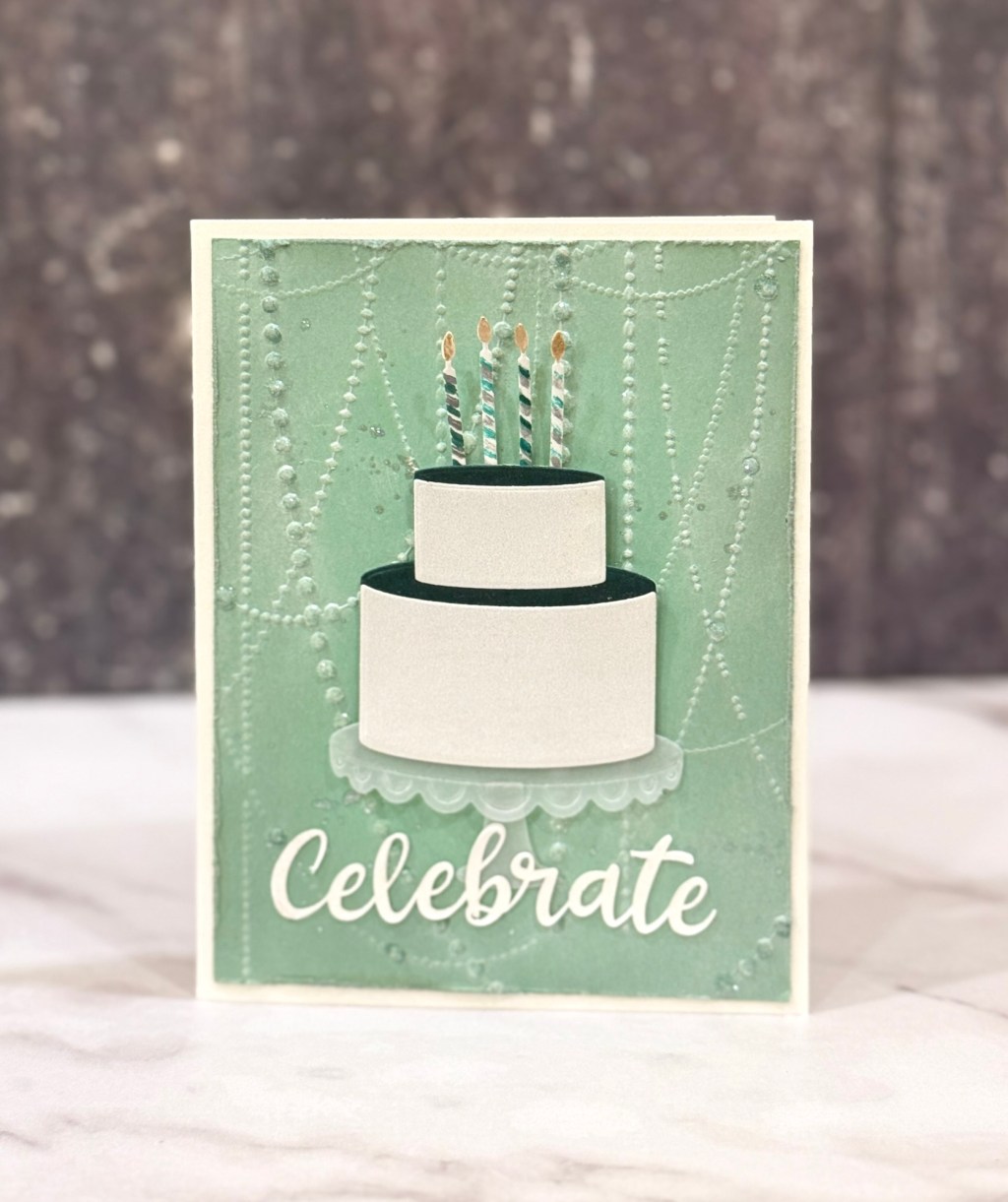
Now here’s some things to know about my Stitched Turnabout™ Stamp: it’s fairly large at about 6×6 inches squared, easy to use with the Turnabout™ Jig and template, and the pattern is thoughtful and very pretty. Unfortunately when you trim it down to a standard A2 (4.25″ x 5.5″ ), an A7 (5″ x 7″) or even a 5″ x 5″ square card you loose a lot of the pretty design from the outer edges (unless they have reissued it since I bought it years ago). There is a complimentary inner Turnabout stamp that will line up perfectly in the center of the larger stamp or that can be used separately. The stamp set also comes with several sentiments and the embroidery look is very pretty. Check out C9’s product video for beautiful cards and design ideas. There are so many possibilities.
I also added little gold hearts to the edge of the center because hearts are some of the elements in the stamp that end up getting cut off and I really like them so made up for them with metallic gold paper and a small recollections heart punch.
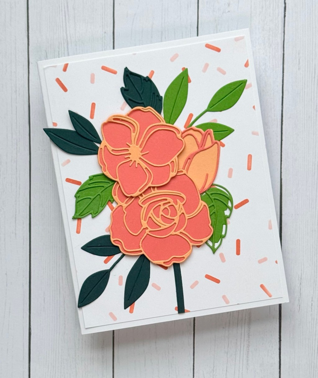
I went on to create another card using these same four colors and a new product that I recently purchased from Simon Says Stamp called Brilliant Coneflower embossing folder and die set. See more of my finished cards using this product here.
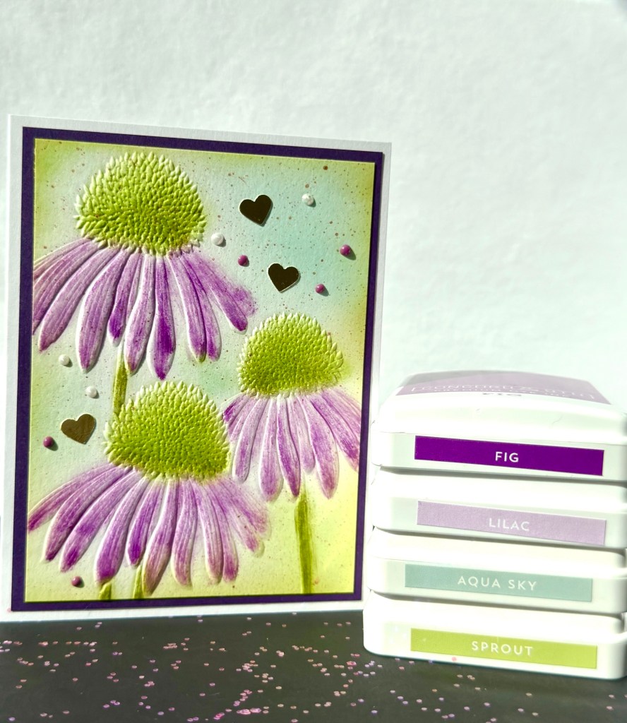
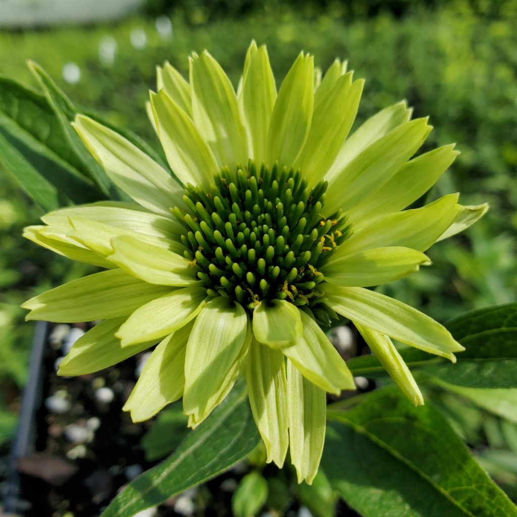
Inspired by the ‘Green Jewel’ Echinacea variety that has a green tinted cone center rather than orange and green petals. I used Lilac and Fig for my petals here and Sprout and Avocado for the flower centers. Aqua Sky was also applied with a blending brush for the background. Not a true ‘Green Jewel’ but it kept me within this color combo.
I then added two shades of Nuvo drops and a little gold spritz for embellishment of the card. And a few gold hearts too. Not my favorite in my Brilliant Coneflower card attempts but still pretty.
Have you used these colors together? And if so, what were your results?


Leave a comment