August 31, 2024
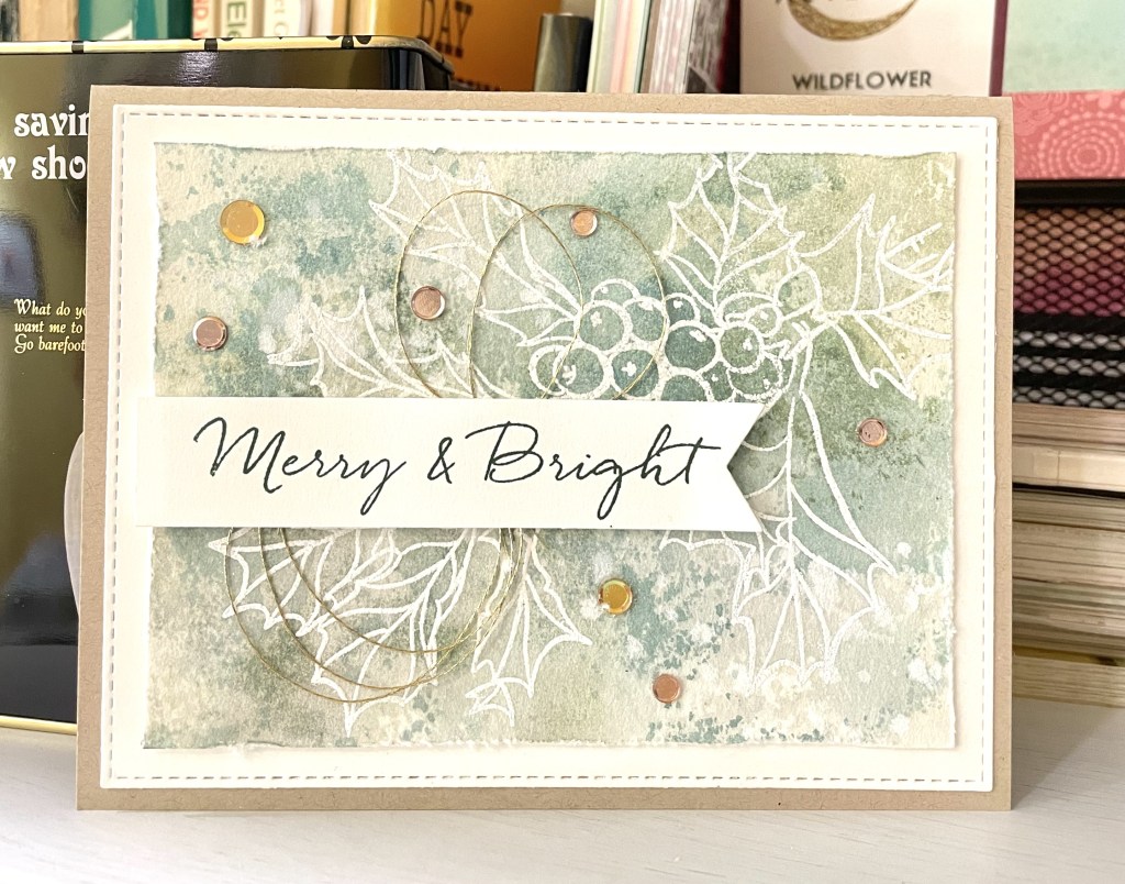
This card was inspired by Debby Hughes at Lime Doodle Design. Check out her great card designs and beautiful watercolor. This was my first holiday card prototype and then it evolved from here. I liked the roughed up edges of this water color layer and went on to enlarge this area as my base rather than using the stitched from base that is shown here in white on a natural card stock card base.
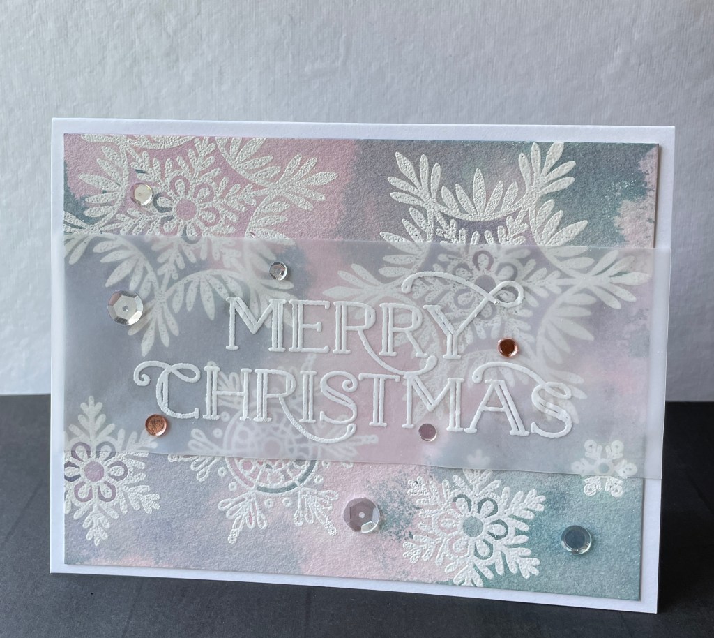
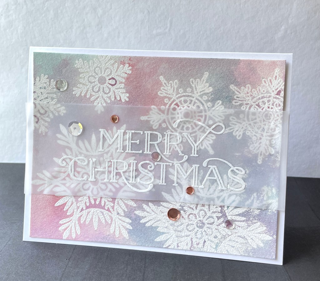
The image is Ellen Hutson’s (EH) Mondo Holly heat embossed in white on hot press water color paper. I then used the smooshing technique to apply various Distress Ink colors on my glass mat. I spritzed water over the inks then smoothed the heat embossed image through the inks. Let it dry then reapply and smoosh inks again. I believe used Speckled Egg and Antique Linen in this card.
The best part of making all of these cards was playing with the inks and how different colors came together.
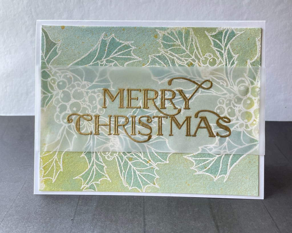
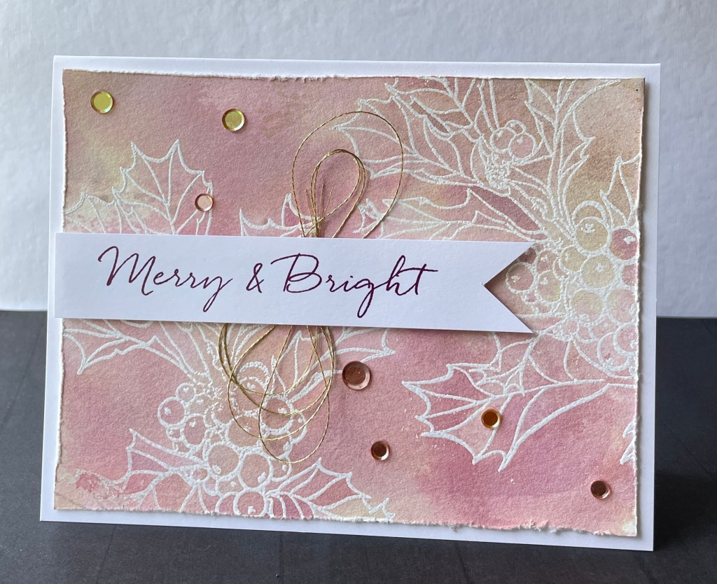
The ‘Merry & Bright’ sentiment is also from EH’s Mondo Holly stamp set. ‘Merry Christmas’ is heat embossed here in gold and it stands out nicely with the green and blue tones of the watercolor (on upper left).
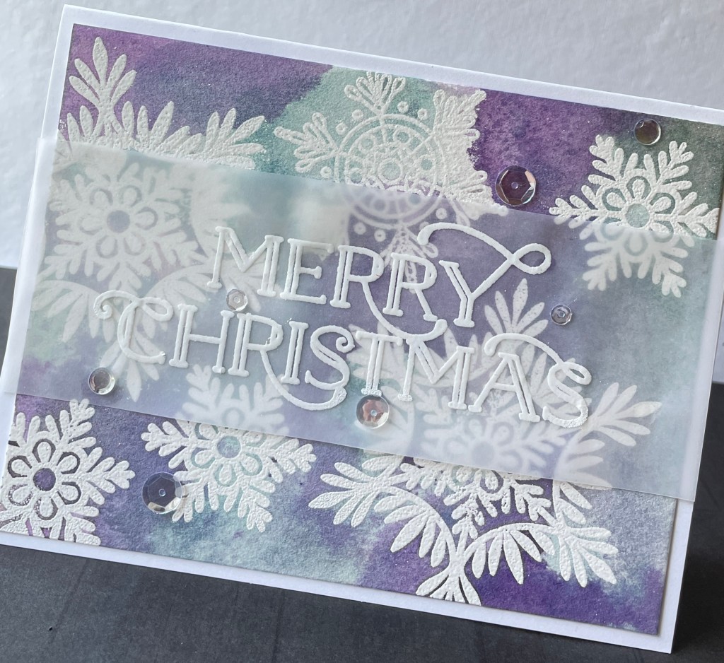
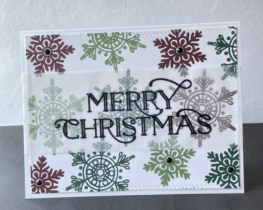
My embossed background image here are several stampings of the snowflakes that also come with the Making Spirits Bright stamp set. I used more purple and blue Distress Inks here and the feel is darker, bolder with more contrast. I also don’t limit myself to using what are considered your typical Christmas colors like reds, greens, and golds. Below are pinks mixed with Speckled Egg. The center card is stamped with snowflakes from Concord & 9th’s (C9) now Flurry Stamp Set in your typical Christmas colors with a black heat embossed sentiment on vellum.
Moving along with dye ink stamped snowflakes I came up with another simple design.
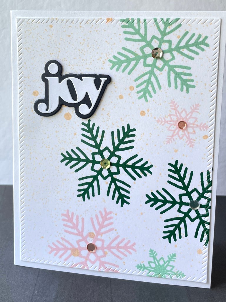
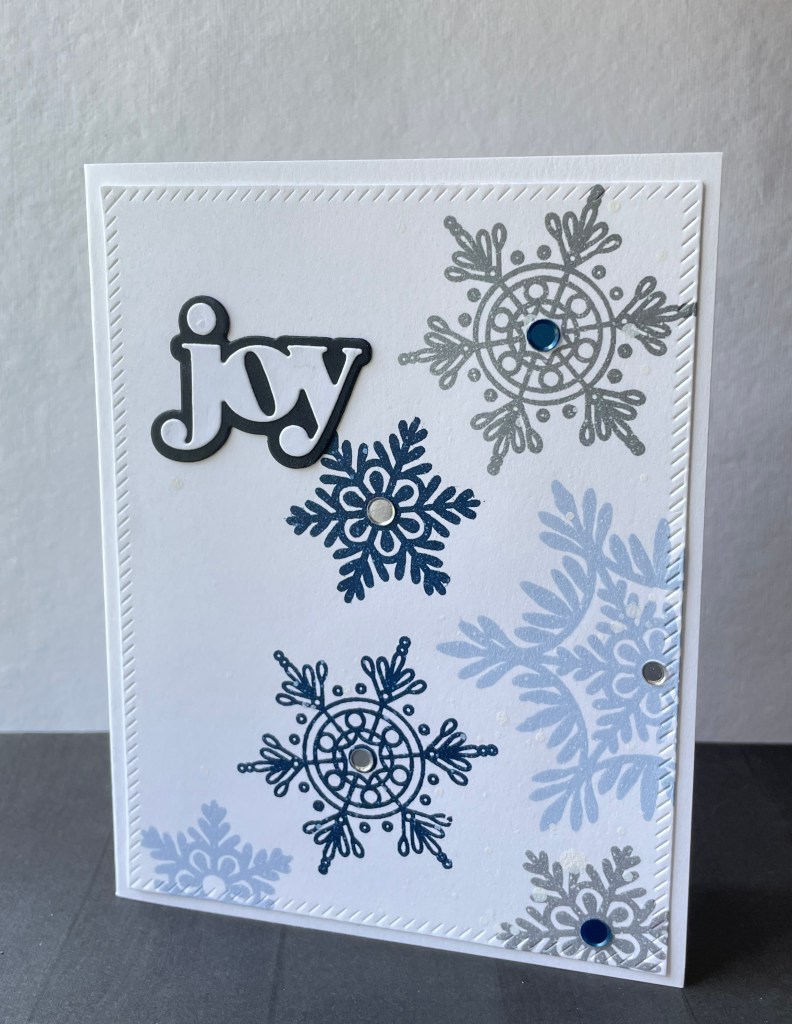
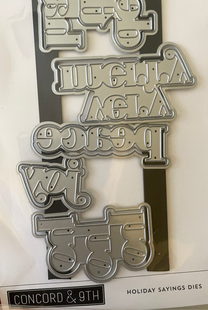
The ‘joy’ sentiment is also from a C9 die set called the Holiday Sayings Dies pictured above. I also used these sentiments in more holiday cards that you’ll see in Part 3. I really like the way greens and pinks work together. I hardly ever use a bold traditional red in my designs. I tend to gravitate towards more wine or burgundy shades. My go to colors are from Catherine Pooler’s Spa Collection of dye inks: Merlot, Sangria. I also am a fan of Gina K’s Plum Punch, another dark jewel tone ink that lends to plum or purple.
Hope you enjoyed these cards!


Leave a comment